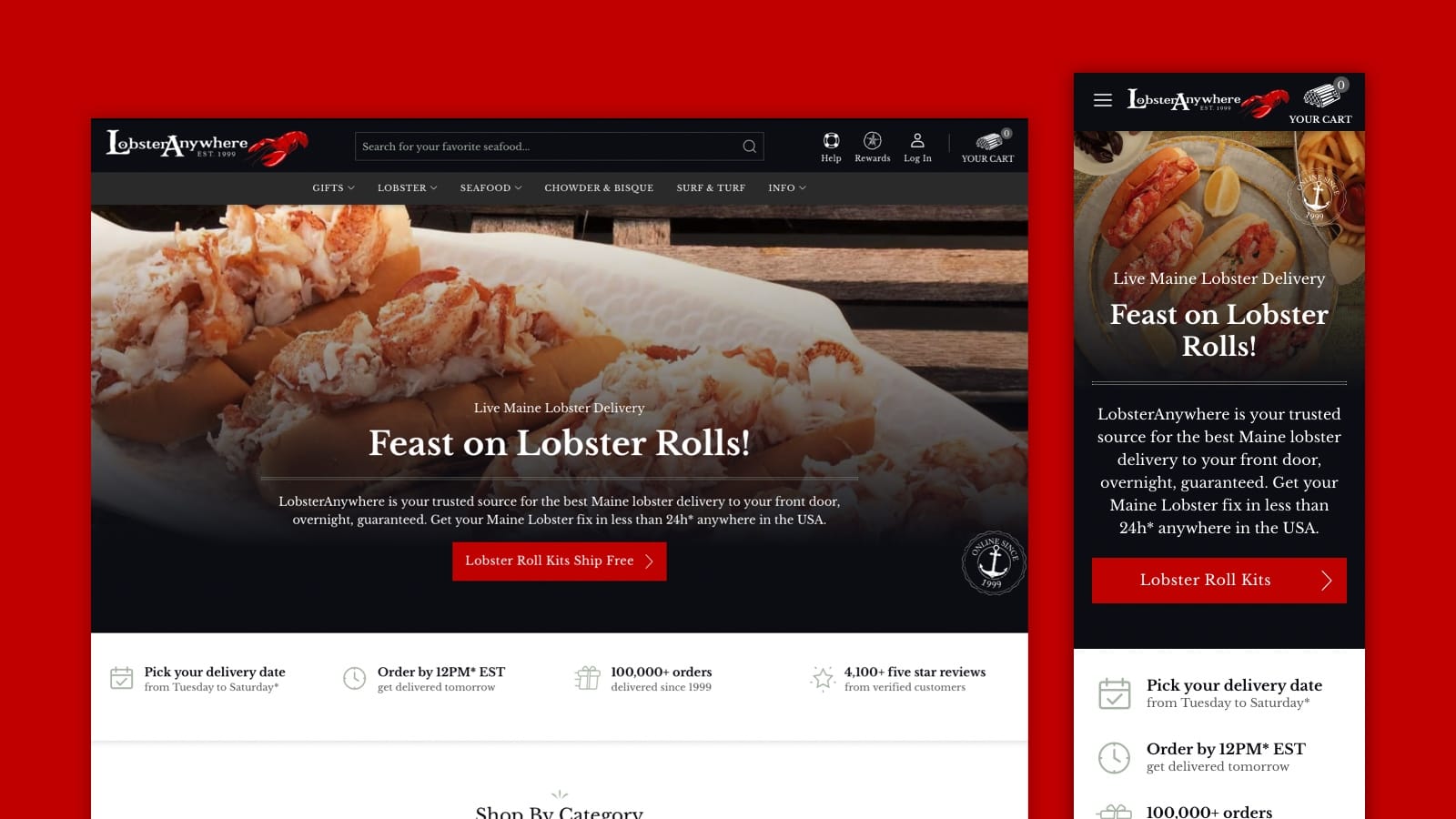
Web Design Features
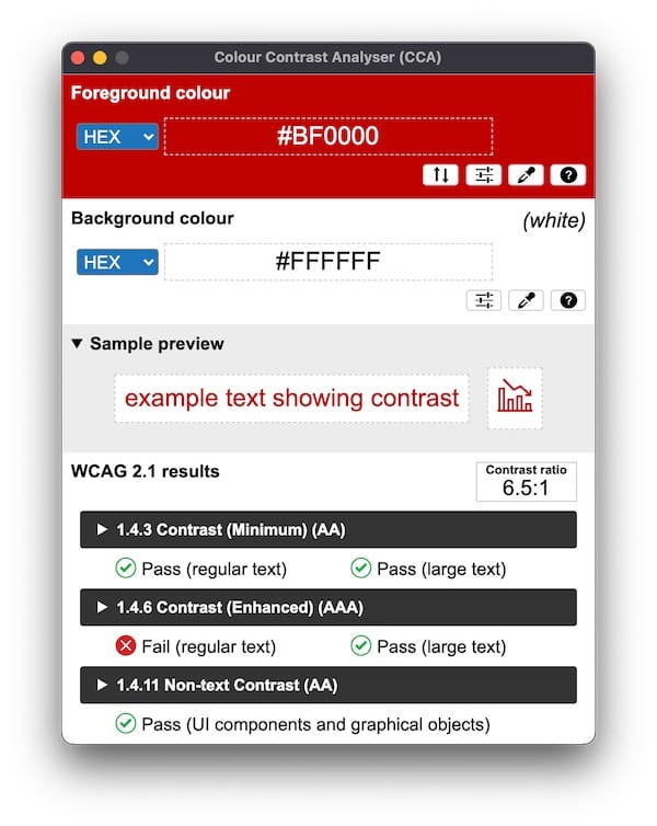
Color scheme and typography
The entire color scheme and typography of the website were chosen for the style and to be easy to read even for people with bad sight (up to some degree) or people with color blindness.
Improved navigation
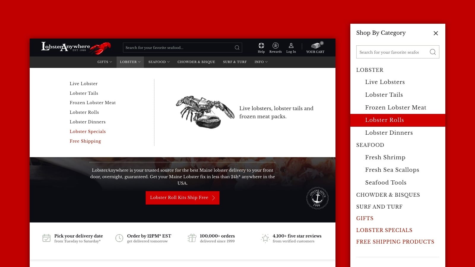
Finding your way around LobsterAnywhere’s website is easy, navigate the dropdown menu or use the “Shop By Category” section to find your favorite seafood.
The menu structure was reorganized to better reflect the company’s product selection and offerings.
Product page optimized for conversion
The product pages on LobsterAnywhere feature a big image of the products, with a slider to show more images, the product summarized information on the right along with the options of the product.
In the product detailed section, you can find more information about the product separated into a few blocks that you can expand and contract. For example, you can see shipping information or nutritional information that applies only to that specific product.
These layout features help users find the most important information about the product, the options available and easily add the products to the cart. While you are reading the detailed description a floating bar appears at the top remember which page you are reading and give easy access to adding the product to the cart.
Simplified checkout steps
LobsterAnywhere already had a good checkout flow, although, Fluid Checkout was used with a few customizations to improve the checkout experience even further.
The checkout process is divided into 5 sections:
- Contact
- Delivery Date
- Shipping
- Billing; and
- Payment
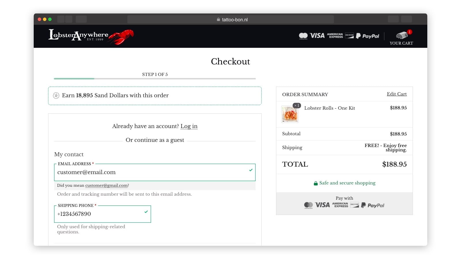
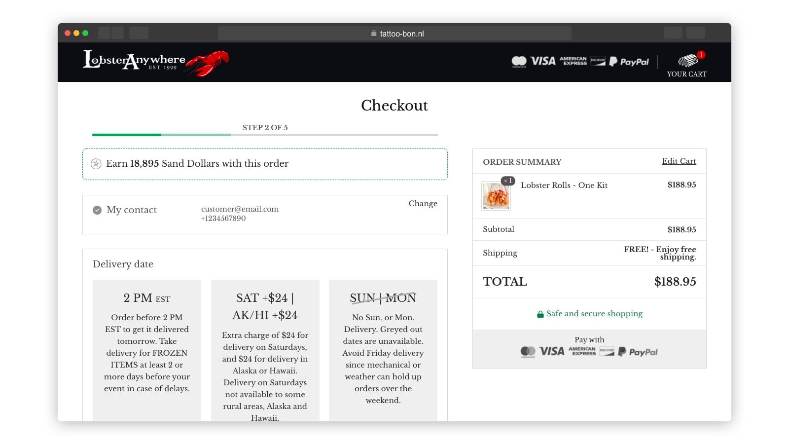
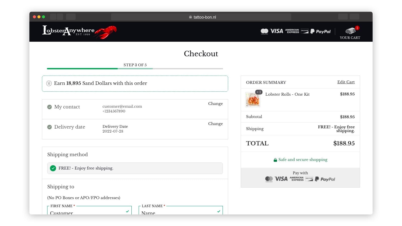
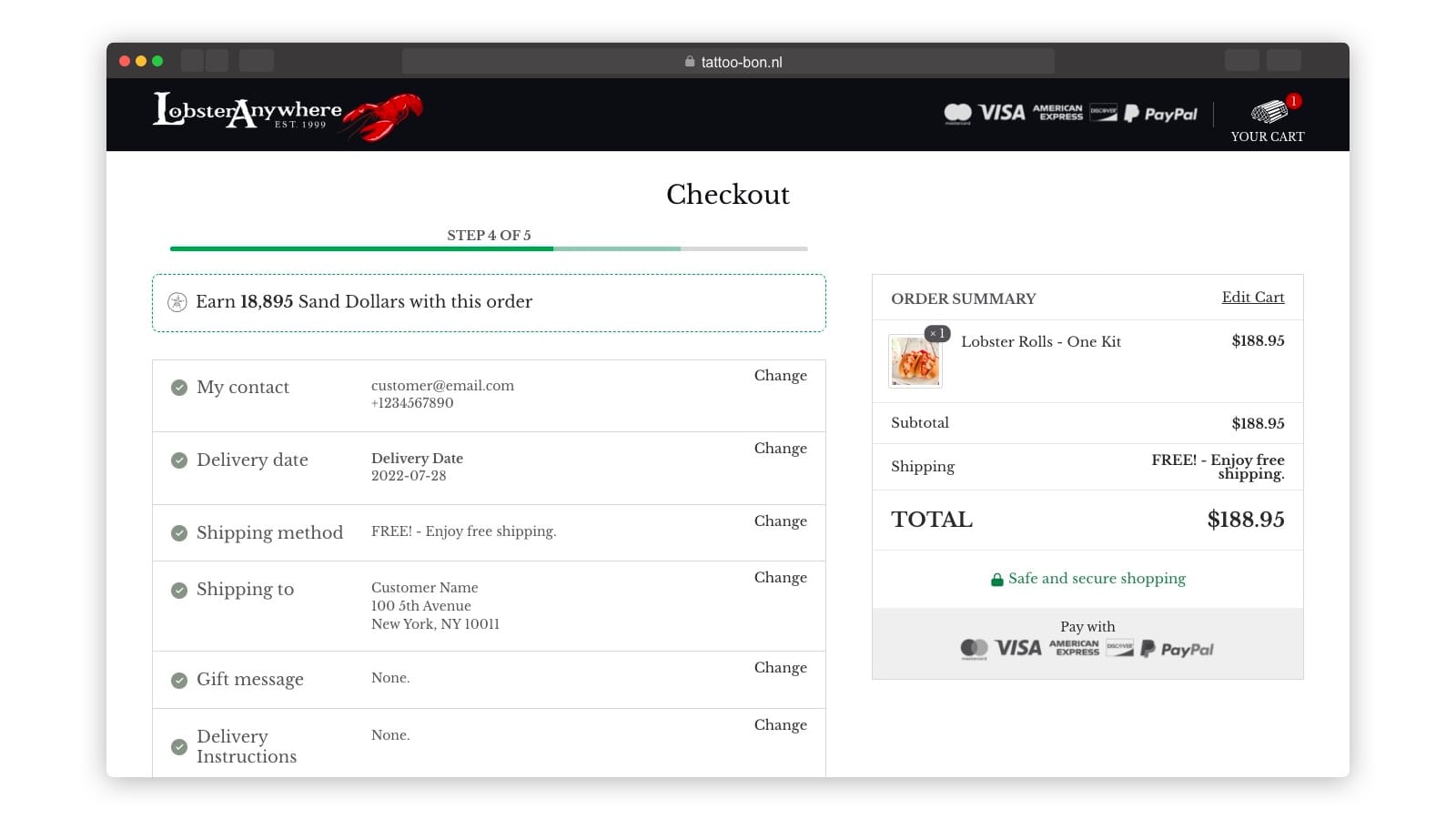
For new users, the Contact step will ask for your contact details, and there is an option to log in. Registered customer, you likely skip to the Delivery step which is then moved to the 4th step. This allow customers to skip most of the checkout fields that would be the same as in previous purchases, they always have the option to change their information.
Delivering live lobsters is a big challenge, and LobsterAnywhere makes it look easy with overnight shipping and scheduled delivery.
At the Delivery Step, you can choose on the calendar the exact date when your purchase will arrive at your door, be it tomorrow or a future date. More information about the delivery rules is displayed in this step, such as days that delivery is not possible or extra charges depending on the selected date.
At the Shipping step, you enter the address for delivery, either your own or the address of the lucky giftee, then you select the shipping method, add a gift message, and add additional notes to your order. If you are a registered customer, you can select the shipping address from previously added addresses saved to your account, no more retyping everything every time you want your lobster treat.
At the Billing step, you enter the address for your billing and invoice, if you are a registered customer, you can also select the billing address from previously added addresses saved to your account.
At the Payment step, choose the way you want to pay and place your order.
All along the checkout process, you can confirm the changes on the order summary on the right side of the screen and on the step review sections for each step; if you are on a mobile phone, the order summary will be displayed right before the “Place order” so you’ll have a chance to review the order before submitting the purchase, and is also available at all times on the page header.
Constantly optimized performance
Fast page loading is a must-have for any website today, it affects customers’ satisfaction and your rankings on search results. LobsterAnywhere website gets a 99% performance score on GTMetrix at the time of writing this. All measured metrics are considered “Good”, which is the best grade applied by the Google Core Web Vitals.


We constantly monitor and work to improve the performance of the website as part of our Website Care Plans, along with other benefits of having us take care of your website maintenance.

